Sébastien Rigaux

Tech watch

← All links

UI/UX

Designing interfaces and flows around user needs.

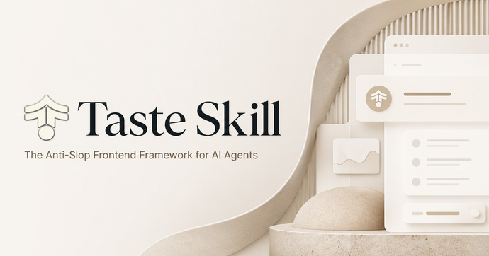
Taste Skill banner on a beige background, with the project name on the left and stacked interface mockups on the right.

Taste Skill gives coding agents a system for building less generic company websites: palettes, hero layouts, UI fragments and real photographs, with art direction tailored to the type of business. The repository offers Claude Code and Codex integrations, plus installation through npx skills.

Its distinctive feature is automated checking in headless Chrome: pages render at four widths, from 390 to 1440 px, and are checked for empty visuals, contrast, alignment and images missing on slow networks. WebGL and scroll effects are limited to tech, gaming and software pages, with static fallbacks for phones and reduced motion.

Leonxlnx

emoji-picker-react provides an emoji picker for React, either with its built-in styling or adapted to a product’s visual design. The interactive playground lets developers try props, CSS themes, and customization examples.

Features include search, skin tones, custom emojis, and multiple languages. Its reactions mode starts with a compact set of popular reactions, then opens access to the full emoji library.

Found via React Status

Puck logo in a blue-to-purple gradient on a white background.

Puck, a visual page editor for React, adds field groups and tabs in version 0.24, along with a checkbox field for selecting multiple options. Drag handles also make it easier to reorder components in nested layouts.

The renderFields API lets you compose these layouts. In the canvas, InlineTextField enables direct text editing, while fieldTransforms transforms values at render time without changing the underlying data.

Fede Bonel TozziFound via React Status

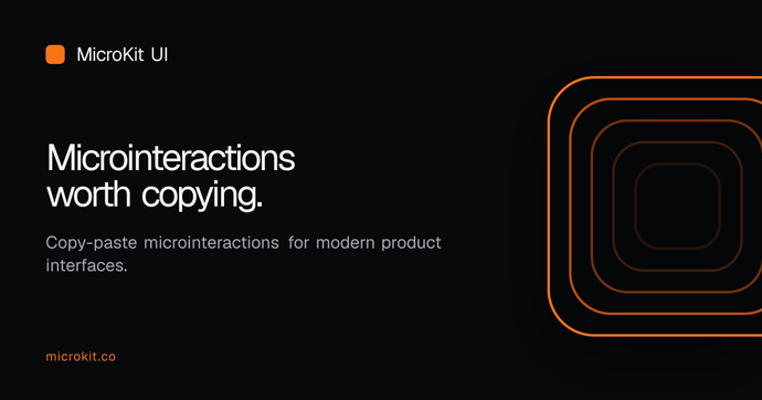
MicroKit UI graphic on a black background, showing the text “Microinteractions worth copying” beside concentric orange rounded squares.

MicroKit collects copy-ready interactions—animated buttons, tabs, inputs and hover effects—with React or CSS and Tailwind variants. Each component is copied separately in JavaScript or TypeScript, with no package to install; 26 of the 54 have no dependencies, while 28 use lucide-react.

The code is MIT-licensed, and Tailwind variants are designed for versions 3 and 4. In the Next.js App Router, most components work in server components; those using state, refs or event handlers need « use client ».

Henrique BaroneFound via Frontend Focus

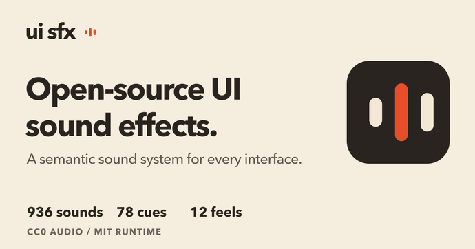
UI SFX graphic showing an open interface sound library with 936 sounds, 78 cues, and 12 sonic styles.

UI SFX groups 78 interface events into 12 sonic styles, so teams can compare how the same feedback feels without changing what it means. The library includes 72 one-shots and six loops, with interactive previews that place sounds in product flows.

Install it with npm install uisfx; its TypeScript API plays sounds and lets callers stop a loop when the associated state ends. Audio files use the CC0 license, while the runtime is MIT-licensed—a clear split that supports reuse in web and native projects alike.

Yuki Capital

White banner with the black text “Next Themes” and GitHub and sponsor icons.

next-themes applies the theme as the page loads, respects the system preference, and syncs the choice across tabs. Its ThemeProvider works with both the App Router and pages/, while a hook lets components switch themes or handle multiple variants.

One architectural detail matters: the browser-stored theme is unavailable during server rendering. UI that depends on useTheme should wait until the client component mounts to avoid hydration errors. The library also updates the <html> attribute—suppressHydrationWarning is recommended—and remains independent of the CSS solution in use.

All UtilityCSS graphic showing the site name and its catalog of Tailwind CSS templates, components, and tools.

All UtilityCSS brings together free and paid Tailwind CSS resources, organized by type, use case, and technology. Its listings include copy-paste components, templates, Next.js starters, and color-management tools, several of which support Tailwind CSS v4’s OKLCH formats.

Filters help narrow the catalog to building blocks for a project, but the directory alone does not guarantee their quality or accessibility. The page advises checking those details with each resource.

Fontastic Space graphic on a dark background, showing an F icon and the subtitle “Anatomy, metrics & compatibility — find mathematically optimal font pairings”.

Fontastic Space compares Google Fonts side by side, with anatomy overlays, OpenType metrics, and compatibility scores. Its Playfair Display + DM Sans example compares x-height, cap height, and string width, then provides CSS rules ready to reuse.

The scores draw on several typographic analysis frameworks, but remain a guide: the tool also lets you inspect the visual result in a paragraph or banner before choosing a pairing.

React Bits banner on a purple background, reading “React Components That Stand Out” and “200+ Free Creative Components”.

React Bits 2.0 announces 216 animated components: 104 have been rebuilt or redesigned, and more than 20 have dropped extra dependencies. Demos add presets and click interactions, while Background Studio, Shape Magic, and Texture Lab have been rebuilt to tune effects live and export the results.

The update also refreshes the documentation and landing page, which is reported to use about five times less JavaScript. The catalog supports expressive interface prototyping; the range of animations still makes it worth assessing their runtime and dependency costs before integrating them into a product.

David HazFound via JavaScript Weekly

Sheet component illustration and highlights from React Aria v1.22.0 release

React Aria v1.22.0 introduces the Sheet component, a swipeable overlay leveraging native browser scroll gestures for smooth, touch-friendly transitions—well suited for mobile trays and notifications. This release also brings Turbopack support for locale optimization, improved handling of interactive widgets like the virtual keyboard, and various fixes for collections, ComboBox, and forms.

Adobe

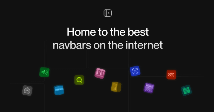
Preview of Navbar Gallery, collection of navigation bar designs

Navbar Gallery offers a curated selection of navigation bars from a wide range of websites, including static navbars, dropdowns, mega menus, sidebars, search bars, and announcement banners. Each example is browsable by type and links to the original site, making it easy to compare concrete navigation patterns for interface design. This resource helps designers quickly find relevant navigation solutions without sifting through generic galleries.

Christina Liubynska

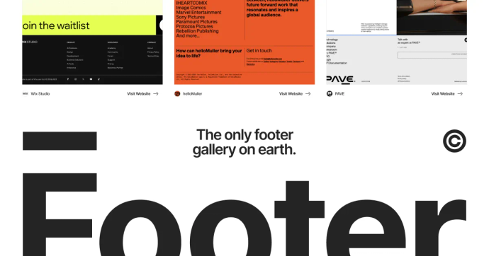
Footer Design gallery preview

Footer Design offers a curated gallery of website footers from diverse projects, sortable by style and type. This resource lets you quickly browse concrete examples for inspiration when designing or updating interfaces. It features typographic, illustrated, grid-based and animated approaches, making it a practical UI/UX reference.

Footer Design

Supahero offers a curated collection of website hero sections showcasing diverse and visually engaging header designs. Each entry highlights different styles, animations, and layouts, making it a practical resource for interface inspiration or design research. While advanced filters are missing, the fast browsing experience lets users quickly explore a wide range of real-world examples.

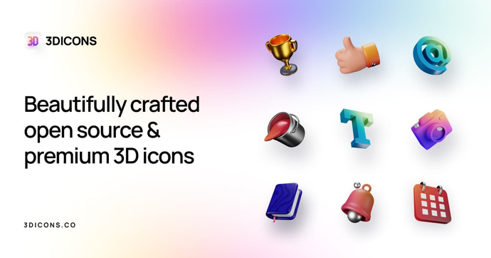
Preview of the 3dicons.co 3D icon collection

3dicons.co offers over 1,400 open-source 3D icons, free to use without attribution for personal or commercial projects. The platform lets you customize color, angle, and download icons individually or in bulk, with themed collections and Figma integration. Its CC0 license makes it easy to incorporate these assets into any application or design system.

realvjy

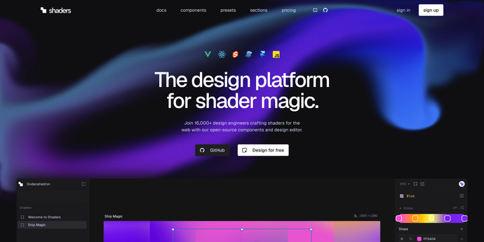
Shaders components documentation illustration: WebGPU effects for React, Vue, Svelte, Solid and JavaScript.

This documentation lists over 190 ready-to-use visual components for integrating WebGPU effects into React, Vue, Svelte, Solid, and plain JavaScript. The components span a wide range: textures, shapes, materials, filters, distortions, transitions, blurs, adjustments, and interactive effects, each with a concrete description of its rendering and parameters. A resource to quickly enrich an interface with advanced visual effects without writing low-level shaders.

Shaders

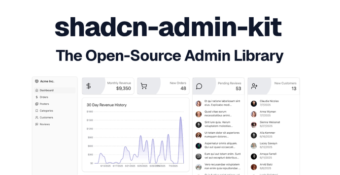
Open-source React blocks for building admin apps

Shadcn Admin Kit provides open-source blocks for building internal tools, dashboards, and B2B apps with React. It preconfigures data tables, forms, authentication, search, and internationalization, with advanced capabilities such as generated CRUD screens, permissions, bulk actions, and undo.