Sébastien Rigaux

Tech watch

← All links

React

Building interfaces with React components, state and rendering behavior.

Tool

react-resizable-panels: three patterns for resizable layouts

react-resizable-panels.vercel.appPermalink
Purple graphic with the words “react resizable panels” beside a symbol made of chevrons and a vertical bar.

The react-resizable-panels documentation introduces React components for building resizable interfaces: panels arranged in rows or columns, grids that resize in two dimensions, and workspaces with tab sets users can rearrange by dragging.

The workspace example shows how to provide an initial model with defaultModel and select tab content through renderTabContent. The package includes TypeScript definitions.


A white card on a pale blue background displays “Fixing a Hydration Mismatch Error and UI Flicker in React” and the label “Blog”.

In Next.js, a localStorage value can make server-rendered HTML differ from the first client render. The article compares the trade-offs: waiting until mount avoids the error but leaves the real content out of the SSR HTML; using the same initial value for both renders preserves that content, though a later update can cause flicker.

To synchronize a sidebar without that flash, an inline script applies its saved state to the DOM before hydration and passes it to React, which uses the same classes. The article also distinguishes an isolated theme control from a mobile backdrop handled with CSS.

Giorgi MoniavaFound via React Digest

emoji-picker-react provides an emoji picker for React, either with its built-in styling or adapted to a product’s visual design. The interactive playground lets developers try props, CSS themes, and customization examples.

Features include search, skin tones, custom emojis, and multiple languages. Its reactions mode starts with a compact set of popular reactions, then opens access to the full emoji library.

Found via React Status

Puck logo in a blue-to-purple gradient on a white background.

Puck, a visual page editor for React, adds field groups and tabs in version 0.24, along with a checkbox field for selecting multiple options. Drag handles also make it easier to reorder components in nested layouts.

The renderFields API lets you compose these layouts. In the canvas, InlineTextField enables direct text editing, while fieldTransforms transforms values at render time without changing the underlying data.

Fede Bonel TozziFound via React Status

React combines <form action>, useActionState, and useOptimistic to handle pending feedback and optimistic updates while keeping form submission available before JavaScript runs. The article shows how this continuity can enhance the interface after hydration without giving up the browser’s native form behavior.

The key is to keep the server action directly in action: inserting a client function breaks submission without JavaScript. For optimistic updates, useHydrated() lets the form choose between the server action and its client-enhanced version.

Found via React Status

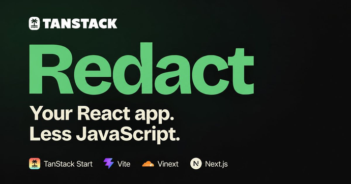
TanStack Redact graphic reading “Your React app. Less JavaScript.” with logos for TanStack Start, Vite, Vinext, and Next.js.

TanStack Redact 0.2.0 replaces React and React DOM in the browser without changing application code. Its stable integrations support TanStack Start, Vite, Vinext, and Next.js; with the latter two, React still handles server rendering while Redact takes over hydration and client rendering.

TanStack’s measurements show bundle reductions from 20.4% to 70.5% across its reference apps, but actual savings vary by project. The tradeoff is explicit: Redact renders synchronously, without React’s time slicing or interruptible rendering. A heavy render can therefore delay input, so compatibility and the busiest screens should be checked in each application.

Tanner LinsleyFound via This week in React

GitHub preview of the shader-effects-inc/shaders repository, described as a WebGPU component library for React, Vue, Svelte, Solid, JavaScript, and Framer.

Tanner Linsley’s AI-driven React projection experiment has become a TanStack project used in production. Redact is a smaller, React-compatible runtime that already works with Start, Next.js, Vinext, and Vite. On the server, React still handles SSR and Server Components.

The tradeoff is in rendering: Redact renders synchronously, without React’s time slicing. As the blog post acknowledges, a heavy render can still delay input. The smaller runtime therefore comes with a constraint worth considering for interfaces that need to remain responsive under load.

Shader Effects, Inc.Found via This week in React

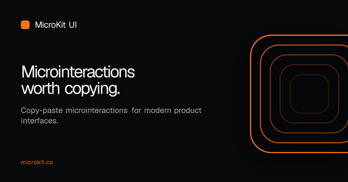
MicroKit UI graphic on a black background, showing the text “Microinteractions worth copying” beside concentric orange rounded squares.

MicroKit collects copy-ready interactions—animated buttons, tabs, inputs and hover effects—with React or CSS and Tailwind variants. Each component is copied separately in JavaScript or TypeScript, with no package to install; 26 of the 54 have no dependencies, while 28 use lucide-react.

The code is MIT-licensed, and Tailwind variants are designed for versions 3 and 4. In the Next.js App Router, most components work in server components; those using state, refs or event handlers need « use client ».

Henrique BaroneFound via Frontend Focus

White banner with the black text “Next Themes” and GitHub and sponsor icons.

next-themes applies the theme as the page loads, respects the system preference, and syncs the choice across tabs. Its ThemeProvider works with both the App Router and pages/, while a hook lets components switch themes or handle multiple variants.

One architectural detail matters: the browser-stored theme is unavailable during server rendering. UI that depends on useTheme should wait until the client component mounts to avoid hydration errors. The library also updates the <html> attribute—suppressHydrationWarning is recommended—and remains independent of the CSS solution in use.

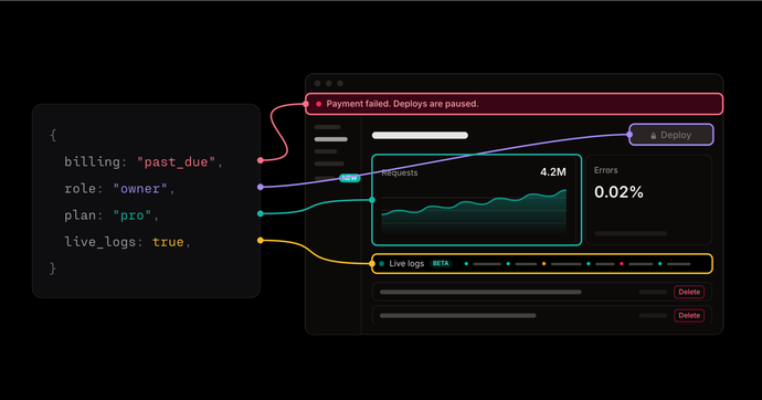
Diagram connecting application state values—billing, role, plan, and live logs—to elements in a dashboard.

When an agent changes a UI, checking a single account cannot cover every role, plan, or feature flag. Matt Rothenberg shows how values scattered across hooks, providers, and layouts can hide overlooked states — such as a Delete button shown to a view-only user.

Making display state an explicit component input lets teams render relevant combinations directly, test them, or compare them in a visual grid. Storybook and Playwright complement this approach, but they do not choose which scenarios to cover; that decision still matters.

Matt Rothenberg

React Bits banner on a purple background, reading “React Components That Stand Out” and “200+ Free Creative Components”.

React Bits 2.0 announces 216 animated components: 104 have been rebuilt or redesigned, and more than 20 have dropped extra dependencies. Demos add presets and click interactions, while Background Studio, Shape Magic, and Texture Lab have been rebuilt to tune effects live and export the results.

The update also refreshes the documentation and landing page, which is reported to use about five times less JavaScript. The catalog supports expressive interface prototyping; the range of animations still makes it worth assessing their runtime and dependency costs before integrating them into a product.

David HazFound via JavaScript Weekly

GitHub advisory for critical remote code execution in React Server Components, showing the React logo and affected npm packages.

A critical vulnerability enables unauthenticated remote code execution in some applications using React Server Components. It affects react-server-dom-webpack, react-server-dom-parcel, and react-server-dom-turbopack in the versions listed in the advisory, with a CVSS score of 9.5.

The described scenario is rare: it requires responses that transport multiple typed arrays and an attacker-controlled value. React applications without a server are unaffected, as are applications that do not use a framework, bundler, or plugin supporting Server Components. Fixes are available in 19.0.9, 19.1.10, 19.2.9, and 19.3.1; affected deployments should upgrade immediately.

mattcarrollcodeFound via JavaScript Weekly

Header illustration for the React folder structure article on Robin Wieruch’s site

This comprehensive overview walks through organizing a React project, from a single file to a modular monorepo structure. The author details how to split code (files, technical folders, feature folders, domains, packages) and the impact of each approach on maintainability, dependency isolation, and scalability. Concrete examples illustrate how to evolve the architecture as the project grows, with clear rules to prevent cross-feature dependencies and encourage reuse.

Robin Wieruch

Sheet component illustration and highlights from React Aria v1.22.0 release

React Aria v1.22.0 introduces the Sheet component, a swipeable overlay leveraging native browser scroll gestures for smooth, touch-friendly transitions—well suited for mobile trays and notifications. This release also brings Turbopack support for locale optimization, improved handling of interactive widgets like the virtual keyboard, and various fixes for collections, ComboBox, and forms.

Adobe

TanStack Start 1.0 stable release poster

TanStack Start 1.0 marks the official stable release of a full-stack framework, already proven in production, that blends SPA-style routing, server rendering, streaming, and typed server functions for React and Solid. Its focus on end-to-end type safety—from route params to loaders and server functions—makes maintenance and evolution easier, even for AI agents. React Server Components are opt-in, and deployment is flexible via Vite, Nitro, or Rsbuild, without enforcing a single architecture.

Tanner Linsley

TanStack Charts 1.0 article illustration

TanStack Charts 1.0 introduces a composable approach to charting, inspired by the Grammar of Graphics, with a framework-agnostic core and a React adapter. The post explains how each chart element (line, point, bar) is a reusable component, making it easy to extend or customize visualizations as requirements evolve. The stable API and granular imports help integrate charts into scalable applications without sacrificing bundle size or type safety.

Tanner Linsley

Illustration for the certificates.dev article on React browser() API

React Canary introduces the browser() API to render a component exclusively in the browser, avoiding hydration mismatches and extra mounted-state logic. The article demonstrates how to use use(browser()) inside a client component, wrapped in Suspense, to defer rendering until browser APIs are available. Several concrete examples show how this approach enables access to localStorage, the DOM, or user-specific data, without the usual workarounds like useEffect or environment checks.

Aurora Scharff

Open-source React blocks for building admin apps

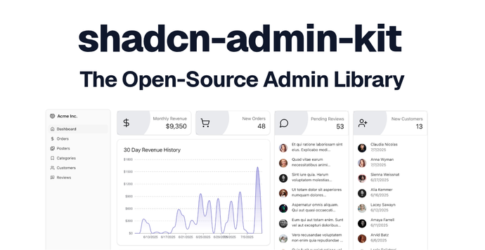
Shadcn Admin Kit provides open-source blocks for building internal tools, dashboards, and B2B apps with React. It preconfigures data tables, forms, authentication, search, and internationalization, with advanced capabilities such as generated CRUD screens, permissions, bulk actions, and undo.